

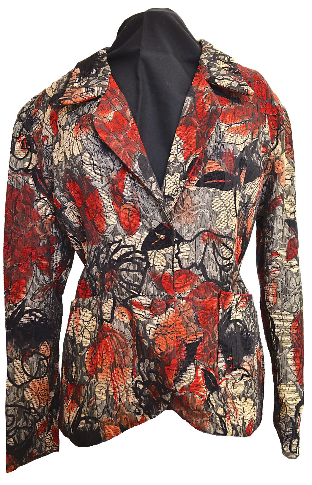
Rachel Hyde, the multi-talented designer from Devon, had the perfect outfit in mind: a jacket that she designed and made for a feature in ‘Sew Hip’ back in 2012. The jacket is stunning and it very clearly needed a special piece of jewellery with which to wear it. Here Rachel gives us an insight into the process that goes into designing a piece of jewellery specifically for an outfit.
So, if this is something you have thought about doing, this feature will help you. One of the trickiest parts about designing something is knowing where to start. The fabric of the outfit will guide your colour choices and the shape and style of the outfit will also guide the style of your jewellery, so you’re halfway there then. This structured starting point is much easier than trying to start from a completely blank canvas.
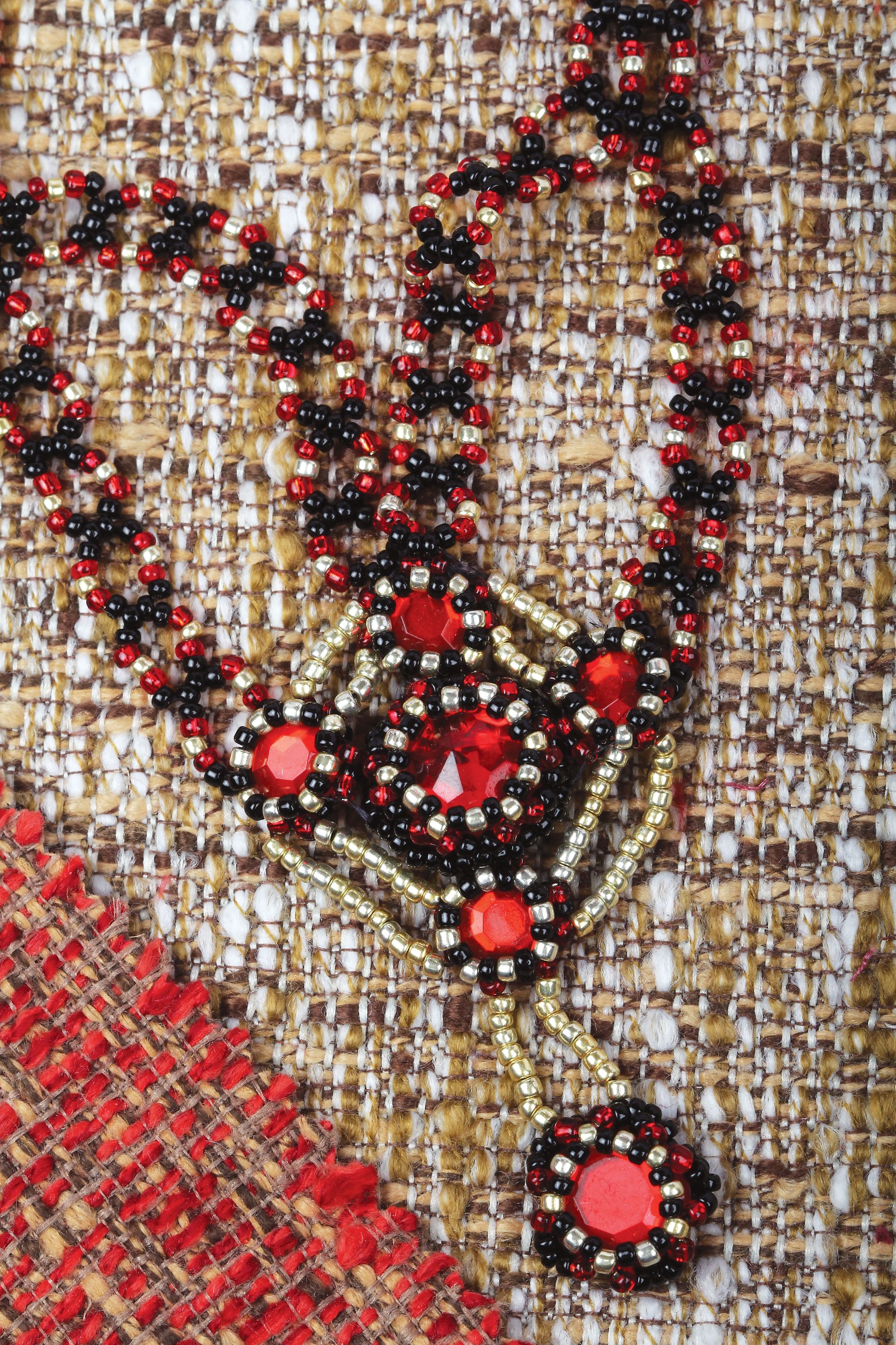
Rachel's answers below help to explain a bit about the design process behind her necklace.
Rachel, how did you decide which of the jacket colours to use? Why did you choose to use all of them, instead of just one?
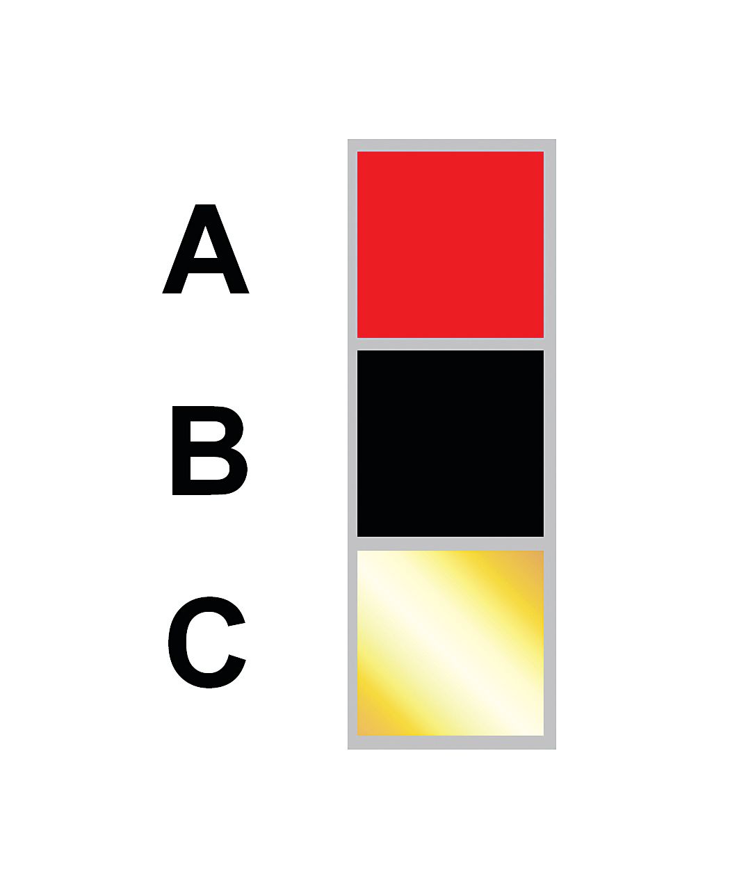
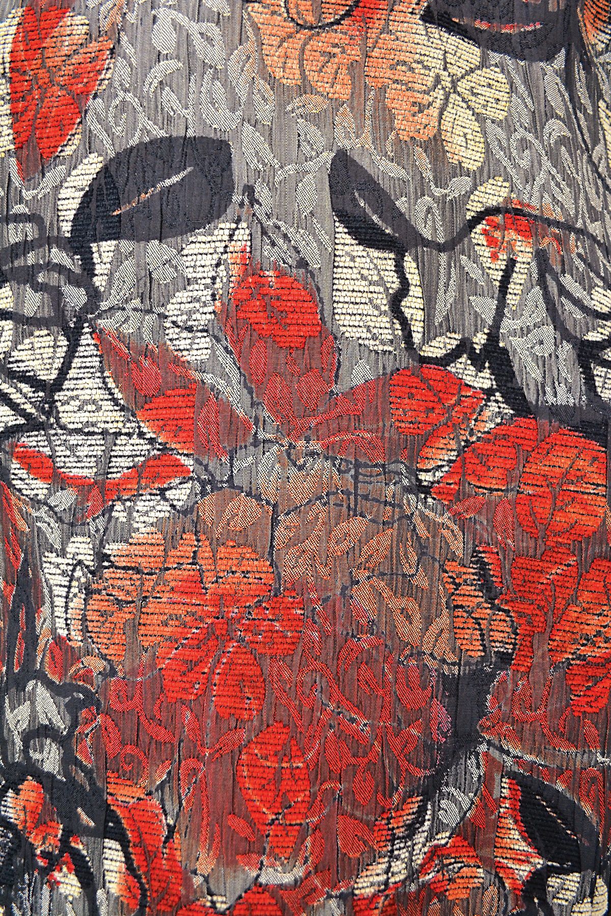
Firstly I scanned in a piece of the fabric and picked out each of the colours in a key. Then I just picked three of the colours: red, black and gold. I know that the main colour which could be selected for a metallic shade is silver, but I dislike this shade and prefer gold so I used that.
The necklace could be made in just one colour and might go with a wider range of garments if it was, but I think that it would look rather plain. Also, I have several other garments that are black, red and gold so the end product goes with quite a few things in my wardrobe.
Can you say something about the colour balance – the red really “pops”, so what are your tips for creating this effect? What should the readers be thinking about when they are mixing a range of colours in order to create an interesting design?
There is quite a lot of red in the fabric and this colour invariably dominates; that is the nature of red. If you want this effect, pick out the most eye-catching colour in your fabric and use that as your bead B. Black is the background of the fabric and a good base colour, and I wanted a metallic shade for bead C and chose gold. Thus you have a base, bright attention- grabbing shade, plus the colour of your metal findings.
How did the style and shaping of the jacket affect your design?
The jacket is a fairly formal, showy garment – a “statement” jacket – made from a rich-looking brocade. Some- how it reminded me a bit of Renais- sance styles and so I chose a Tudor look for the necklace. The way the pendant points downwards echoes the deep reveres of the jacket front, and is the right length for this.
Do you have any other handy tips for readers who might want to try design- ing their own piece of jewellery to match an outfit?
Ask yourself this set of questions:
How many colours are there in the fabric, and do I want to use all or just some/one of them? What else will I usually be wearing with this garment?
When do I wear this garment/ outfit? Do I want something formal, casual, what season, time of day etc? Do I want this jewellery to match other outfits too or just this one?
What shape of jewellery will go with this outfit? What will be visible while I am wearing it? Think of neck shape, sleeves etc, also practicality.
Have a look in your stash at what you already have and think what needs to go with it. Then I draw a rough sketch of the garment and/or scan in a photo of it to a graphics program and start to draw in ideas. Sometimes it helps to Google words that you associ- ate with the piece. Here that would be Renaissance jewellery, Tudor, brocade, rhinestones, bezelling and seed bead designs.
This is all fabulous advice from Rachel, so I hope it will help you with your own designs!
Check out the pattern for Rachel's beautiful matching piece which you can find here on Beading.live, and make it for yourself. Why not match the colours to your own favoutie outfit. The project is titled: Made to Match.